MediCheck
case study
Cuello, Maria Agustina

This personal project highlights my UX/UI skills and design process by tackling the challenges of medication management. It involves user research, persona development, and prototyping to create an effective solution for improving adherence and health outcomes.
Timeline: 10 days
Team: Independent UX Designer
Tools: Figma Design, Figma Jamboard, Canva
World Health Organization. (2003). Adherence to long-term therapies: Evidence for action. World Health Organization.
I decided to base my user research on people living currently in my country Argentina.
As soon as I started the project I decided to conduct a user research in a survey form, for that I used Google Forms, and I questioned participants about their medication usage, the problems they have with following a treatment, if they have used any application to help with that and functionalities or tools they expect on an app that can help them with their medicine intake.
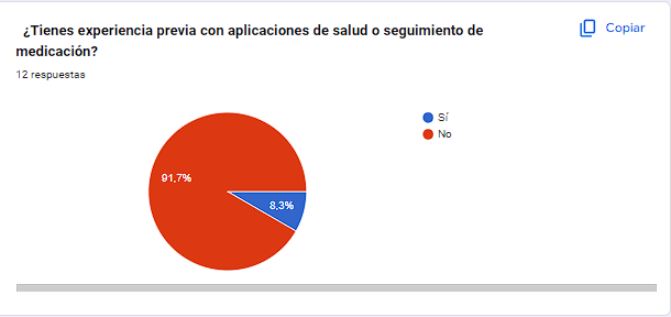
None of them have used an app for treatment adherence , except for one wh uses an app for their menstrual cycle.
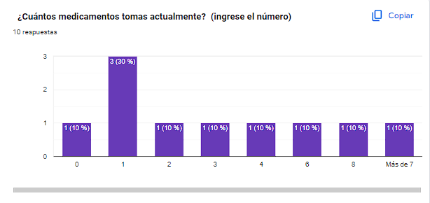
In terms of older adults,the number of medicines they are taking is more than 3 on average.
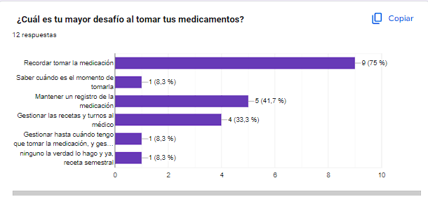
The main needs were to know what medication they are taking and when they need to do it.
The app needs to focus on tracking the medicine and adding reminders for it.
It has to be easy to use for adults and fast to add new medication expecting that the user will have more than one medicine to add.
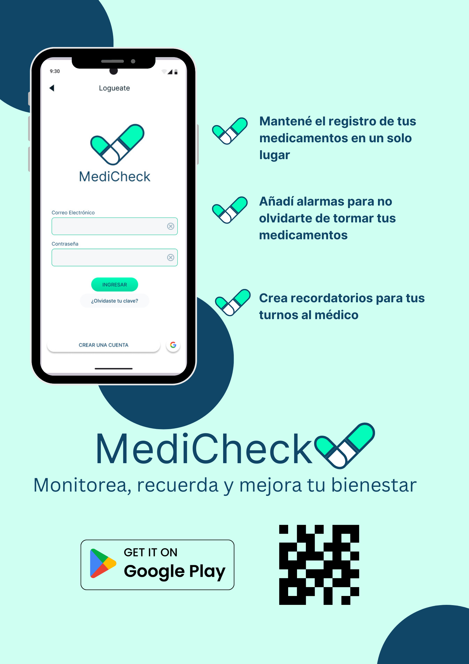
While researching, I found some main problems that people faced with some similar applications. Most information was in English, and the notification functionality was not working properly. I also noticed that some of them had many functionalities that people were not using. I decided that my solution had to be completely in Spanish and have a few main functionalities in its first design
After conducting user research, I focused on creating user personas and journey maps to ensure a user-centric design approach. Utilizing Figma Jamboard, I synthesized insights from interviews to develop one detailed persona that represent the diverse needs and challenges of potential users.
The journey maps illustrated the user experience, highlighting pain points and opportunities for improvement. This iterative process allowed me to keep the users' perspectives at the forefront, guiding design decisions and ensuring that the final product effectively addresses their needs.
%20(1).jpg)
Ricardo Perez is an older adult who needs a user-friendly mobile application to track his medication intake because it will help him remember to take his medications consistently, improving his adherence to treatment and supporting his overall health.
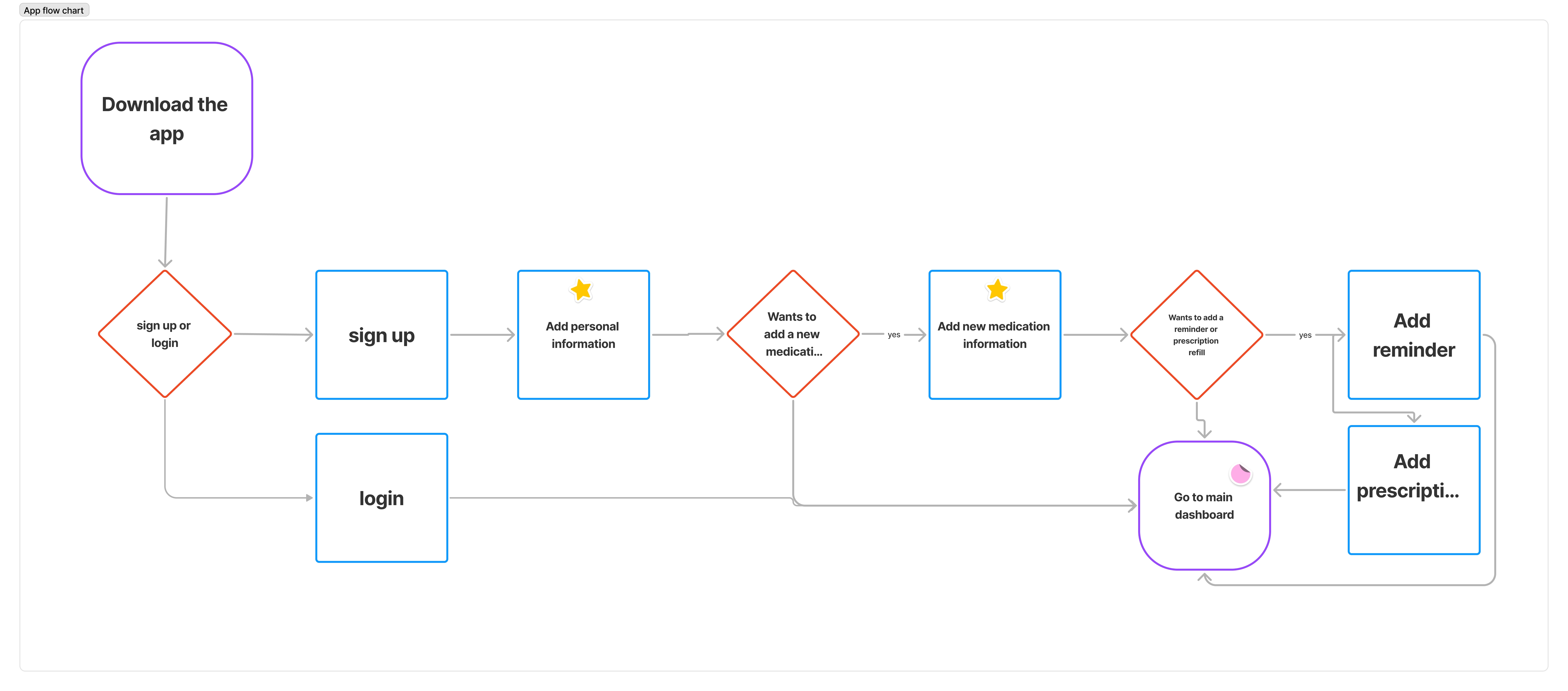
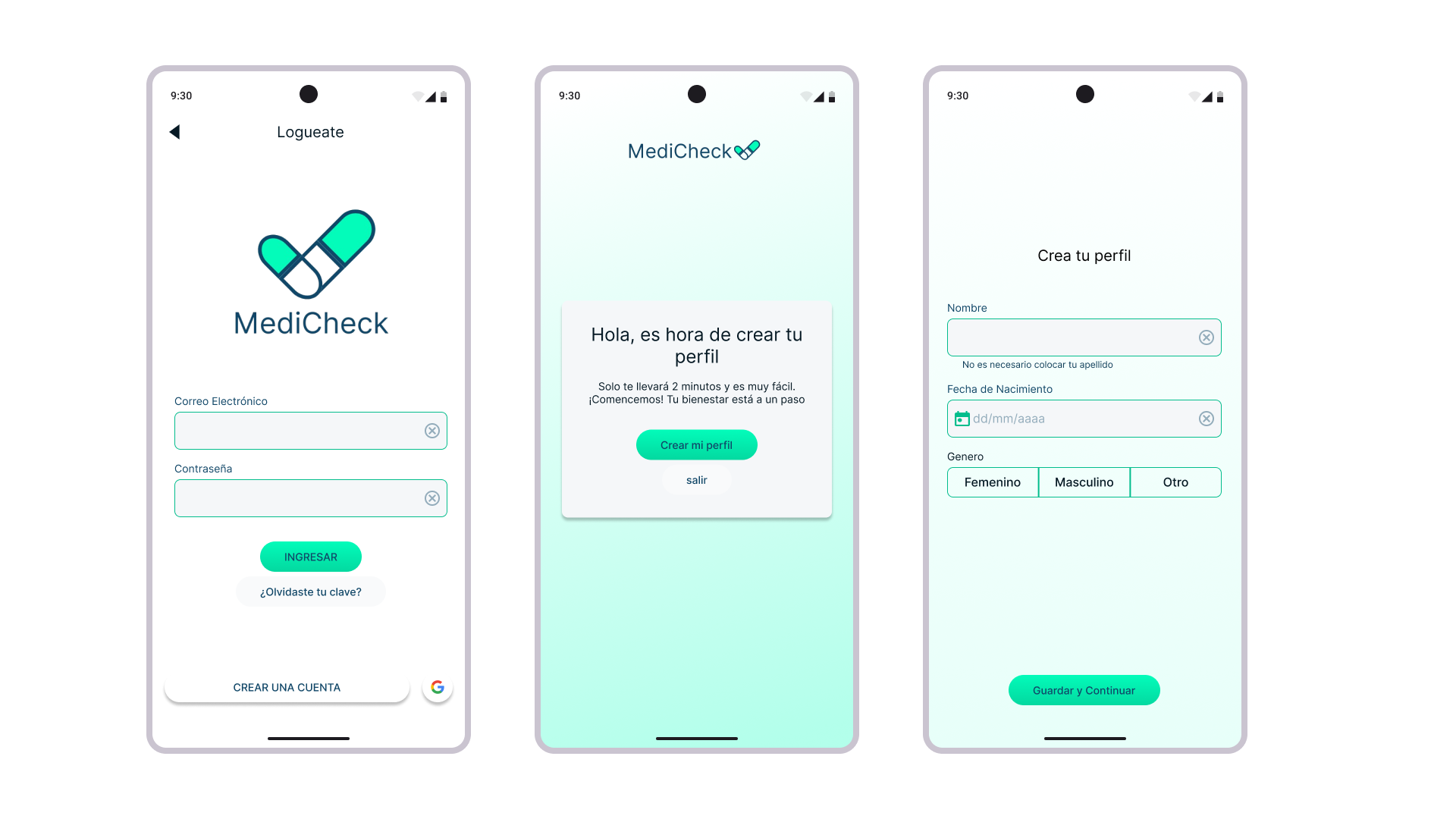
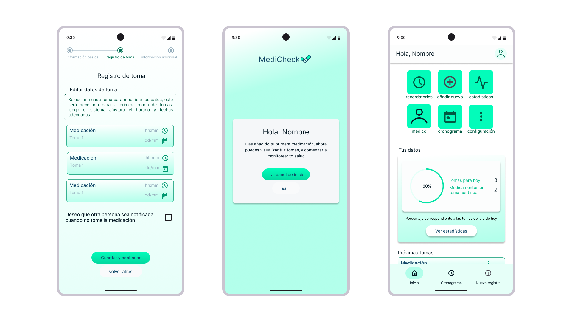
While doing the map journey I realized project that the main point was working on adding the first medication so I decided to focus on that section of the app due to time constraints. So for this project, the main flow is getting the user from downloading the app to adding his first medication.
If Ricardo can easily add and track his medications in the app, then he will achieve better adherence to his treatment plan and improve his overall health.
I started sketching some basic ideas of how the boarding process would be and after doing the diagram flow I started doing some simple wireframes to see the distribution of information and the visual keys for the onboarding process and adding the first information.
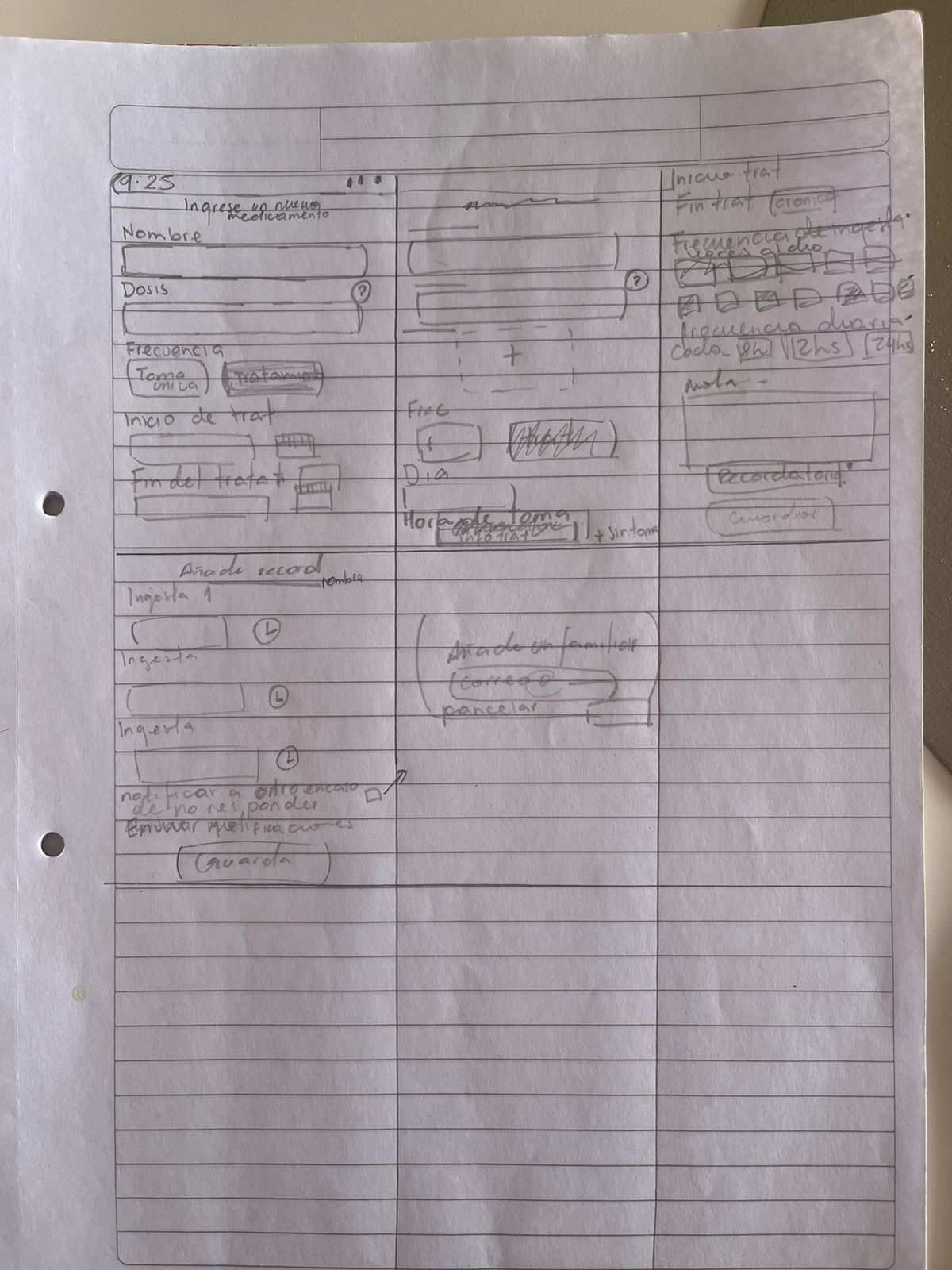
For the information Architecture I desided to do some flow diagrams to viasually see how theprocess to get the person from signing up to use the application. That is when I decided that the main point was the adding of the first medication. So I created a specific flow for that diagram the viasually see how the information would be distributed and what the specific requirements would be.
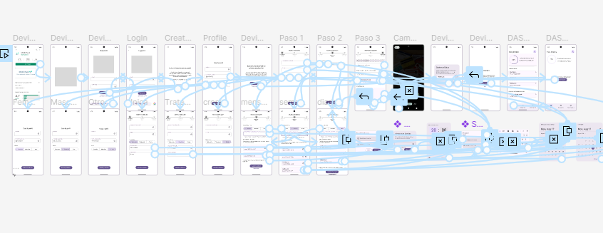
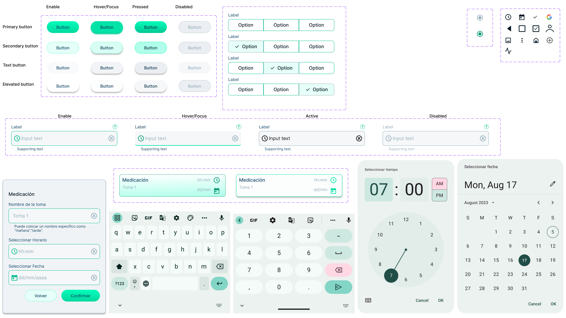
To create a mid-fidelity prototype I used the Material 3 Design system on figma, based on my paper wireframes I created a fast and easy prototype so I could test on the user how the information architecture was structure first and then work on the visuals.
Once the first prototype was completed I conducted two interviews.
The main task was to do the onboarding process, from the download of the app to adding the first medication.
There I got some insights mostly on the information architecture, in terms of the information itself, how the questions were worded but also on the hierarchal structure of the information.
This gave me some insights to develop a better prototype.
Lack of clear instructions
Wrong distribution of information
Confusion on the terms used
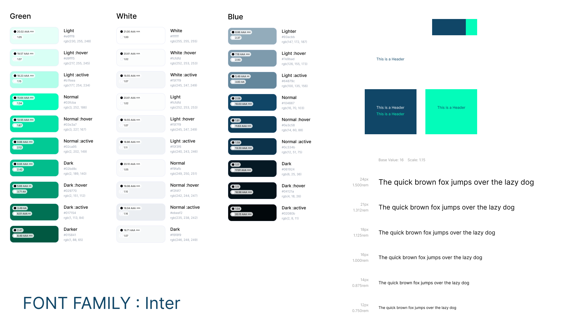
I use Figma as the main tool for the high-fidelity prototype and Canva for the brand logos. I created a full Design System for the project, colors, typography, and basic components with its variants to simulate the most real use when doing the interviews.
I conducted a new User interview for the final prototype.
For this interview the task was the same as previously download the application and complete the onboarding process from signing up to adding a new medication
Vissually appealing
Easy and fast to start using
No doubts during onboarding process
Through this project, I gained valuable insights into the importance of user-centered design. Conducting user interviews taught me how to empathize with users and understand their unique challenges, while developing personas and journey maps helped me visualize their experiences. I improved my skills in creating wireframes and interactive prototypes using Figma, and learned how crucial user feedback is in refining designs.Overall, this project reinforced my ability to translate user needs into effective solutions, enhancing both my design process and problem-solving skills.
As I continue to develop my skills and explore new opportunities, I’m eager to connect with like-minded professionals and potential employers. If my design work resonates with you or aligns with your needs, I’d love to discuss how we can collaborate or how I can contribute to your team.